Air Pollution Heat mapping using QGIS
24 Apr 2023 (753 Words, 5 Minutes)
Recently I came across a tool called Quantum Geographic Information System.
QGIS, also known as Quantum Geographic Information System, is a free and open-source software for creating, visualizing, analyzing, and managing geospatial data. It is a powerful tool that allows users to create maps, edit spatial data, and perform various spatial analysis tasks.
QGIS can be particularly useful in mapping air pollution data as it provides a variety of tools to process and display data in a spatial context. The software allows users to import data from a range of sources, including shapefiles, CSV files, and databases. This means that data collected from air quality monitoring stations can be easily imported into QGIS for analysis and visualization.
PM2.5, or particulate matter 2.5, refers to tiny particles that are smaller than 2.5 micrometers in diameter. These particles are a form of air pollution that can have a significant impact on human health and the environment. PM2.5 can come from a variety of sources, both natural and human-made. Natural sources include dust, wildfires, and volcanic eruptions, while human-made sources include emissions from cars and trucks, power plants, and industrial processes. When inhaled, PM2.5 particles can penetrate deep into the lungs and even enter the bloodstream. Exposure to high levels of PM2.5 has been linked to a variety of health problems, including respiratory and cardiovascular diseases, as well as lung cancer. In addition to its effects on human health, PM2.5 can also have negative impacts on the environment. It can contribute to climate change by absorbing and reflecting sunlight, and it can also harm crops and natural ecosystems.
Many cities and countries have set air quality standards for PM2.5 in order to protect public health. Efforts to reduce PM2.5 pollution include regulations on emissions from vehicles and industrial sources, as well as the promotion of cleaner energy sources such as wind and solar power. Individuals can also help reduce their exposure to PM2.5 by avoiding areas with high levels of pollution and using air filters in their homes.
Once the data is imported, we can use QGIS to display the data on a map, allowing us to identify areas with high levels of air pollution. QGIS provides a range of options for visualizing data, including heat maps, choropleth maps, and scatter plots. This allows us to choose the most appropriate method for visualizing their air pollution data, depending on the nature of the data and the questions they are trying to answer.
In addition to visualizing air pollution data, QGIS provides a range of tools for spatial analysis. This includes tools for calculating statistics, identifying spatial patterns, and performing spatial queries. For example, we can use QGIS to calculate the average levels of air pollution in different areas or to identify areas where air pollution levels are above a certain threshold.
Rendering Heat Maps for Air Pollution :
New Delhi, India
- Data set
Read about using OpenAQ’s API for fetching the data in JSON here.
Using the curl command I issued request on their API endpoint which yielded me the desired results, initial dates from 1st Jan 2023 to 31st Jan 2023 for New Delhi state in India.
curl https://api.openaq.org/v2/measurements?city=Delhi&date_from=2023-01-01T00:00:00+00:00&date_to=2023-01-31T23:59:59+00:00&limit=10000
You can tweak the command above for any other desired state, location, or the amount of data yielded. Convert JSON to CSV and adjust the coordinates columns (Latitude and Longitude) accordingly.
Finalizing the Heat map with the said data points -
Download the Dataset from here
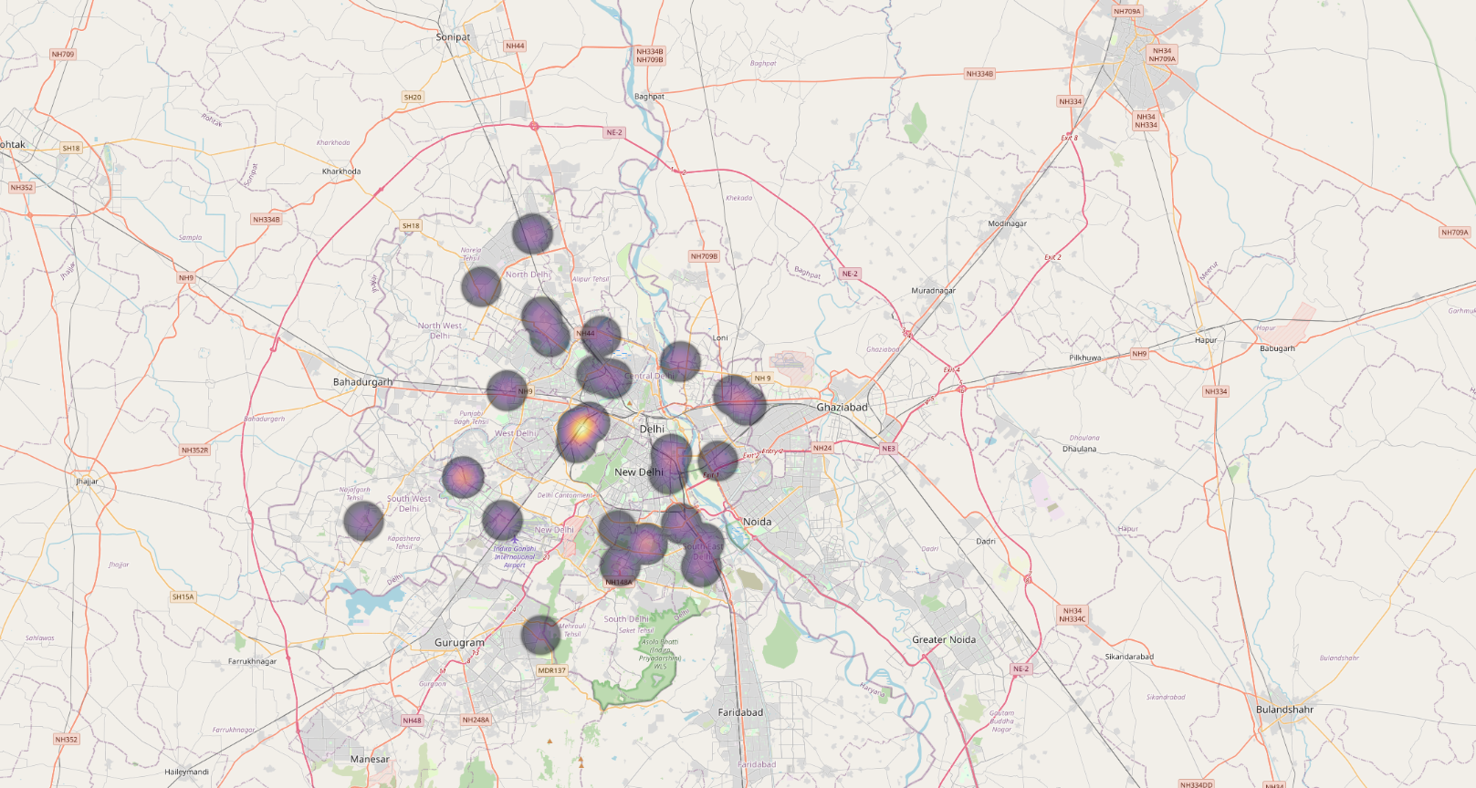
It shows Fine Particulate Matters which are 2.5 microns or lesser in diameter. We can notice several place with levels of above 35 μg/m3 within a span of month, over a period of time this is very harmful.
California, United States of America
- Data Set
Adjust the date range, the particles to take account on, the states etc from here. For our purpose of producing Heat map for air pollution in California, we will adjust the parameters accordingly.
Download the Dataset which is used for the Heat Map from here
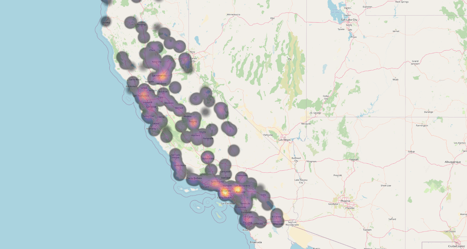
We can notice excess of air pollutants in the region of -
- Sacramento
- San Francisco
- Fresno
- Santa Clarita
- Los Angeles
- Riverside
- San Bernardino
New York, United States of America
- Data Set
Adjust the date range, the particles to take account on, the states etc from here. For our purpose of producing Heat map for air pollution in New York, we will adjust the parameters accordingly.
Download the Dataset which is used for the Heat Map from here
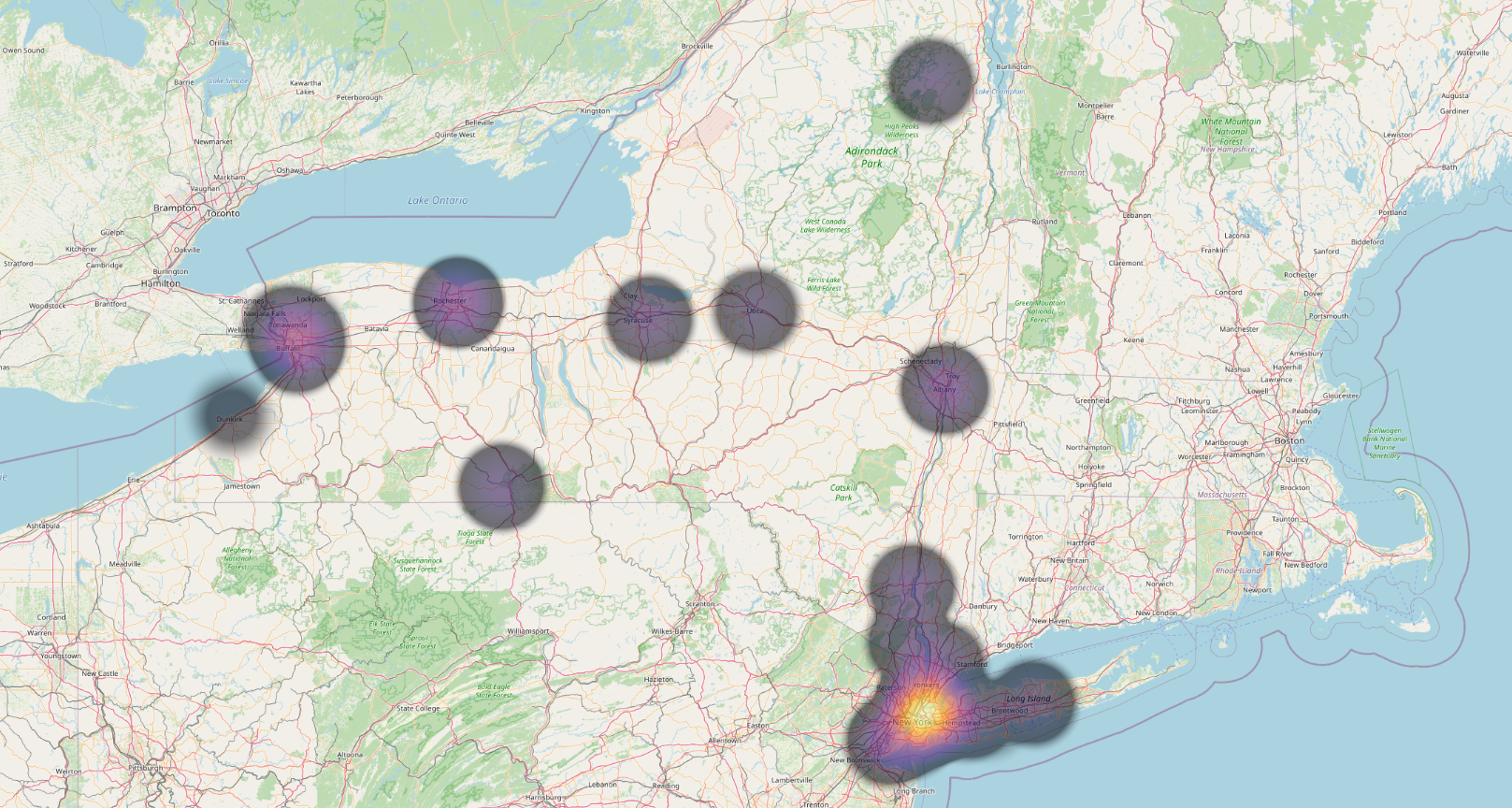
We can notice dense pollutants concentration in the region of New York itself, meanwhile other zones has lesser amount respectively.
Hopefully we gained insights on visualzing the Air Pollution heat maps using QGIS. An incredible tool which can perform much more analysis on the dataset and can render much more complex results.